The Live! Horizon Session Performance dashboard provides live information on whether the user (read: session) is experiencing good or bad performance. This dashboard shows all the VDI Sessions and RDS Sessions. For each session, it shows the datacenter performance and the network performance. Use this dashboard to check if there are any problems in meeting the demands of the users.
This is the primary dashboard for performance. It is complemented by the Live! Horizon DaaS Performance dashboard. This secondary dashboard complements the Live! Horizon Session Performance dashboard by showing the pools and farms are not performing.
Design Consideration
This dashboard shows four heat maps that are placed next to each other. The first two are for VDI and the last two are for RDS. The two VDI heatmaps form a pair and so do the RDS heat maps. They complement each other and should be used together. The location of each pod and session within those pods is identical in both the heat maps. This fixed positioning allows you to compare the problems that occur in the datacenter or network.
The size of the sessions is designed to be constant. Variable sizing creates a distraction as the focus here is not capacity. Variable sizing can potentially result in small boxes making it hard to read from a distance.
How to Use the Dashboard
Look at each heat map and see if there are any colors other than green.
-
Green indicates that the sessions are performing based on the KPI used.
-
Red indicates an early warning. Stringent thresholds are used to enable proactive attention and remediation operations. As high standards are applied, it is possible that the heat map is showing red, but there are no complaints from the affected user yet.
-
Light gray indicates that there is no session running (it has been disconnected) and the metric is not computing.
For an NOC Operator, drill down by selecting one of the sessions on the heat map.
-
The line charts show the performance counters.
-
The two VDI heat maps drive the VDI health charts, and provide relationship (context).
-
The two RDS heat maps drive the RDS health charts, and provide relationship (context).
As part of the deployment, configure auto rotate among the NOC dashboards. If you only want to show one dashboard, you can remove the vRealize Operations menu by using the URL sharing feature. This makes the overall UI clean, allowing you to focus only on the dashboard.
Points to Note
This dashboard shows both RDS and VDI. If you only have one of them, collapse the widgets you do not need and expand the ones you need.
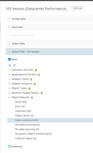
To show the session that is connected, select Data receiving in the Output Filter section.
