The Flow Insight page provides an insight into data centers, devices, and flows. It is a context-based page as it performs analysis based on the entities, flows, and the time range that you select.
To access the Flow Insight page, see Access Flow Insight page.
Alternatively, you can search for Flows and in the search result page, click Flow Insight.
- Top Talkers
- What's New
- Network Performance
- Outliers
Top Talkers
- By Flow Volume: Indicates the traffic volume.
- By Traffic Rate: Indicates the rate of traffic.
- By Session Count: Indicates the number of sessions.
- By Flow Count: Indicates the number of flows
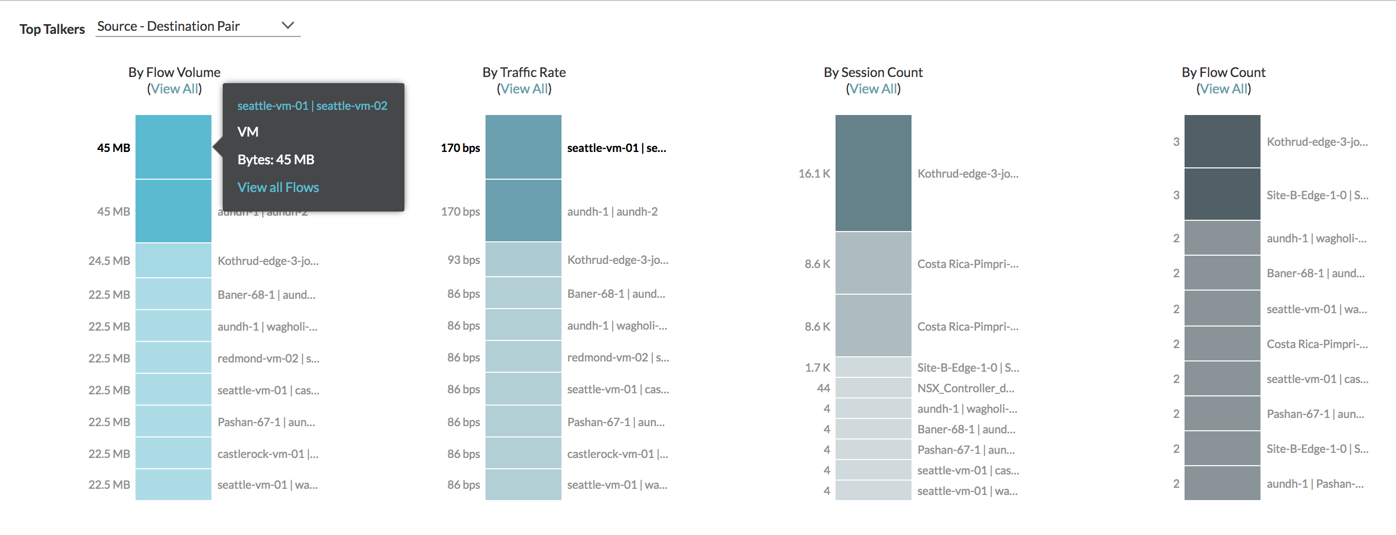
- If a VM appears in one or more metrics, when you point to that VM in a bar, it will also be highlighted in other bars.
- When you click a VM in the metrics bar, the complete list of flows coming to this VM is shown.
- When you select VM as the entity in the Top Talkers list, all the flows related to this VM irrespective of it being the source or destination is shown. If you select Source VM in the list, then only the flows coming from this VM are considered.
- If you are considering the physical flows, you can select either Source IP or Destination IP.
- After you select the Source-Destination pair and point on the metric bar, if you click the link in the tool tip, the corresponding dashboard appears. For example, for a VM in Sourec-Destination pair, the VM-VM path dashboard appears.
- For a flow group view or a flow entity projection or a flows group query, you cannot see the Flow Analytics button.
What's New
- New Virtual Machines Accessing Internet: Lists the new VMs that access Internet.
- New Internet Services Accessed: Lists the new Internet services discovered in the environment.
- New Internal Services Accessed: Lists the new intranet services that are discovered and accessed from the Internet endpoint.
- New Internal/E-W Services Accessed: Lists the services that are exposed and accessed by the machines within a data center
- New Services with Blocked Flows: Lists services that have blocked flows. This section is populated only for IPFIX.
- New Firewall Rule Hits: Lists the new firewall rules that are brought into effect. This section is populated only for IPFIX.
- New App-Ids: Lists the new application IDs. This section is populated only for NSX Intelligence.
Network Performance
- Inter-Host
- Intra-Host
- Internet
- All Flows
In the following example, there are two different ranges of TCP RTT, one is less than equal to 30 ms and the other is 30-120 ms. You can find there are total 151 flows comes under the less than equal to 30 ms TCP RTT range. Out of the 151 flows, 9 flows are shown as an abnormal flow.
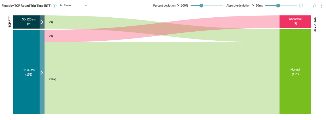
To get more insight about the TCP RTT distribution information and counts of flows, click the colored line in the visualization. In the following example, you can see the detail insight about the TCP RTT distribution information and counts of flows:
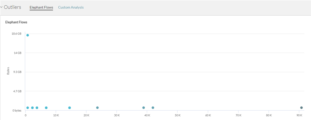
Outliers
- Elephant Flows: This section helps to identify the flows which have small count of sessions and high throughput versus flows which have large count of sessions and small throughput. Typically, the flows with the large session counts and small throughput are also referred as mice flows. The analysis is based on the ratio of bytes to the number of sessions. Each dot in the graph represents multiple flows. When you point to a dot, you can see the list of flows. To view the details of a particular flow, click that flow in the list.
- Custom Analysis: This section allows you to visualize the flow data on 2 dimensions of your choice. It helps in analyzing the data to find the outliers in various ways.
Note: The metrics represented in this section are the approximate values and not the exact values.