


The tables on the Baseline Drift pages provide the greatest detail and flexibility in viewing drift results, but you might want a graphic representation of drift to use as a quick reference indicator of changes in files on your network.
You can display graphs of Baseline Drift Reports as graphic portlets on a dashboard page in the console.
The console includes pre-configured portlets, the individual graphs that make up a Dashboard, that provide baseline drift information. You can choose any portlet with “Drift” in its title to see an example of graphic presentation of drift information.
To create your own drift portlets, consider the following tips:
- The horizontal size of portlets varies according to the layout of the dashboard they are displayed on. You might need to move the portlet on the dashboard or change the dashboard layout to accommodate the data in a baseline drift portlet. You can also select the data and the type of graph you display so that the portlet is appropriate for the presentation format.
- Consider how many items will appear on the X axis. The Portlet Editor allows you to limit the items displayed on the X-axis to the 5, 10, or 15 with the highest or lowest values, but this means that you are not seeing all of the data from the report. So if, for example, you have 1000 computers, you might choose to show drift by policy instead of by computer – you can always drill down to the more detailed information in console tables. (Similarly, if you use the Split by feature in a portlet, limit the number of items that will split the bar, column or other element in your portlet.)
- Use the Preview feature in the Portlet Editor to see how your data will appear before you save the portlet.
- If a Baseline Drift Report has a Report Size of Summary Only (an option in the Advanced Options panel), it will not have sufficient data for use in the Dashboard. Only reports that have a Report Size of Full Details can be displayed graphically.
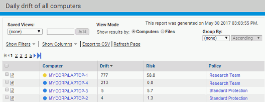
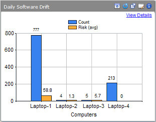
The following example shows information presented in a Baseline Drift Report Results table and then displays it again in a graphic portlet. On a demonstration system with 5 or fewer computers running the agent, you can view drift by computer in a graph. (This is less likely to be useful in a production environment.)
The following image displays the drift report in tabular form:
The following image displays the same information in a Dashboard. Clicking View Details in the Dashboard view brings you back to the full report table.
For more information about dashboards, see Using and Customizing Dashboards.
