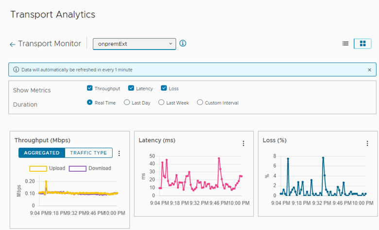
HCX Transport Monitor provides detailed, time-series throughput, latency, and loss information for the uplink networks in a Service Mesh.

Transport Monitor provides a graphical representation of underlay network performance for each uplink network. Transport Monitor collects the metrics every minute. For each selected uplink, the page provides the same information:

  • Metrics selections: Throughput, Latency, Loss

  • Duration selections: Real Time, Last Day, Last Week, Custom

  • Graphic displays based on selected metrics and duration

In some scenarios, metrics data is not available for an uplink and underlay analytics information is not displayed:

  • The Service Mesh appliance tunnels are down.

  • The source environment is using Network Address Translation (NAT).

  • The firewall security policies disallow the ICMP traffic.

Procedure

  1. From the Transport Analytics page in the HCX Manager UI, select Transport Monitor.

    HCX displays the Transport Monitor page.

    ""
  2. At the top of the page, use the pull-down menu to select an uplink network.

    The information icon to the right of the pull-down menu specifies which Service Mesh configurations use the selected uplink network.

  3. At the top right of the page, click one of the icons to toggle the orientation for graphs between the inline and the portrait mode.
  4. For Show Metrics, click the check box in front of each option that you want to display: Throughput, Latency, Loss.
  5. For Duration, select the time frame to display in the graph:

    Duration

    Description

    Real Time

    The system automatically updates the information in the graph every 1 minute.

    Last Day

    Displays information from the last 24 hours.

    Last Week

    Displays information from the last 7 days

    Custom Interval

    Displays information for the selected date range.

  6. Review the graphs for each metric type:

    Graph

    Description

    Throughput

    Displays the amount data traffic using the uplink network from all HCX services. At the upper-right of the graph, you can select from the Aggregated or the Traffic Type data. Aggregated data combines the traffic throughput for all HCX migration and Network Extension services using the uplink. Traffic Type displays the data separated by the migration or the Network Extension traffic.

    In either case, the graph displays both upload and download throughput.

    To display the minimum threshold for each migration type, use the Show Thresholds pull-down menu in the upper-right corner of the graph.

    Latency

    Displays the latency of underlay network supporting the uplink.

    To display the minimum threshold for each migration type, use the Show Thresholds pull-down menu in the upper-right corner of the graph.

    Loss

    Displays the percentage of data loss for the underlay network supporting the uplink.

    To display the minimum threshold for each migration type, use the Show Thresholds pull-down menu in the upper-right corner of the graph.