


Create an accelerator.yaml file in Application Accelerator
This topic tells you how to use Application Accelerator to create an accelerator.yaml file in Tanzu Application Platform (commonly known as TAP).
By including an accelerator.yaml file in your Accelerator repository, you can declare input options that users fill in using a form in the UI. Those option values control processing by the template engine before it returns the zipped output files. For more information, see the Sample accelerator.
When there is no accelerator.yaml, the repository still works as an accelerator but the files are passed unmodified to users.
accelerator.yaml has two top-level sections: accelerator and engine.
Accelerator
This section documents how an accelerator is presented to users in the web UI. For example:
accelerator:
  displayName: Hello Fun
  description: A simple Spring Cloud Function serverless app
  iconUrl: https://raw.githubusercontent.com/vmware-tanzu/application-accelerator-samples/main/icons/icon-cloud.png
  tags:
  - java
  - spring

  options:
  - name: deploymentType
    inputType: select
    choices:
    - value: none
      text: Skip Kubernetes deployment
    - value: k8s-simple
      text: Kubernetes deployment and service
    - value: knative
      text: Knative service
    defaultValue: k8s-simple
    required: true
Accelerator metadata
These properties are in accelerator listings such as the web UI:
-
displayName: A human-readable name.
-
description: A more detailed description.
-
iconUrl: A URL pointing to an icon image.
-
tags: A list of tags used to filter accelerators.
Accelerator options
The list of options is passed to the UI to create input text boxes for each option.
The following option properties are used by both the UI and the engine.
-
name: Each option must have a unique, camelCase name. The option value entered by a user is made available as a SPeL variable name. For example,
#deploymentType.You can specify your own default name by including:
options: - name: projectName label: Name inputType: text defaultValue: myname required: true -
dataType: Data types that work with the UI are:
stringbooleannumber- Custom types defined in the accelerator
typessection - Arrays of these such as
[string],[number], and so on.
Most input types return a string, which is the default. Use Boolean values with
checkbox. -
defaultValue: This literal value pre-populates the option. Ensure that it’s type matches the dataType. For example, use
["text 1", "text 2"]for the dataType[string]. Options without adefaultValuecan trigger a processing error if the user doesn’t provide a value for that option. -
validationRegex: When present, a regex validates the string representation of the option value when set. It doesn’t apply when the value is blank. As a consequence, don’t use the regex to enforce prerequisites. See required for that purpose.
This regex is used in several layers in Application Accelerator, built using several technologies, for example, JavaScript and Java. So refrain from using “exotic” regex features. Also, the regex applies to portions of the value by default. That is,
[a-z ]+matchesHello worlddespite the capitalH. To apply it to the whole value (or just start/end), anchor it using^and$.Finally, backslashes in a YAML string using double quotes must be escaped, so to match a number, write
validationRegex: "\\d+"or use another string style.
The following option properties are for UI purposes only.
-
label: A human-readable version of the
nameidentifying the option. -
description: A tooltip to accompany the input.
-
inputType:
text: The default input type.textarea: Single text value with larger input allowing line breaks.checkbox: Ideal for Boolean values or multi-value selection from choices.select: Single-value selection from choices using a drop-down menu.radio: Alternative single-value selection from choices using buttons.
-
choices: This is a list of predefined choices. Users can select from the list in the UI. Choices are supported by
checkbox,select, andradio. Each choice must have atextproperty for the displayed text, and avalueproperty for the value that the form returns for that choice. The list is presented in the UI in the same order as it is declared inaccelerator.yaml. -
required:
trueforces users to enter a value in the UI. -
dependsOn: This is a way to control visibility by specifying the
nameand optionalvalueof another input option. When the other option has a value exactly equal tovalue, ortrueif novalueis specified, then the option withdependsOnis visible. Otherwise, it is hidden. Ensure that the value matches the dataType of thedependsOnoption. For example, a multi-value option (dataType = [string]) such as acheckboxuses[matched-value]to trigger another option whenmatched-value(and onlymatched-value) is selected. See the following section for more information aboutdependsOn.
DependsOn and multi-value dataType
dependsOn tests for strict equality, even for multi-valued options. This means that a multi-valued option must not be used to trigger several other options unfolding, one for each value. Instead, use several single-valued options:
Instead of
options:
  - name: toppings
    dataType: [string]
    inputType: checkbox
    choices:
      - value: vegetables
        text: Vegetables
      - value: meat
        text: Meat
        ...
  - name: vegType
    dependsOn:
      name: toppings
      value: [vegetables] # or vegetables, this won't do what you want either
  - name: meatType
    dependsOn:
      name: toppings
      value: [meat]
  ...
do this:
options:
  - name: useVeggies
    dataType: boolean
    inputType: checkbox
    label: Vegetables
  - name: useMeat
    dataType: boolean
    inputType: checkbox
    label: Meat
  - name: vegType
    dependsOn:
      name: useVeggies
      value: true
  - name: meatType
    dependsOn:
      name: useMeat
      value: true
  ...
Examples
The later screenshot and accelerator.yaml file snippet that follows demonstrates each inputType. You can also see the GitHub sample demo-input-types.
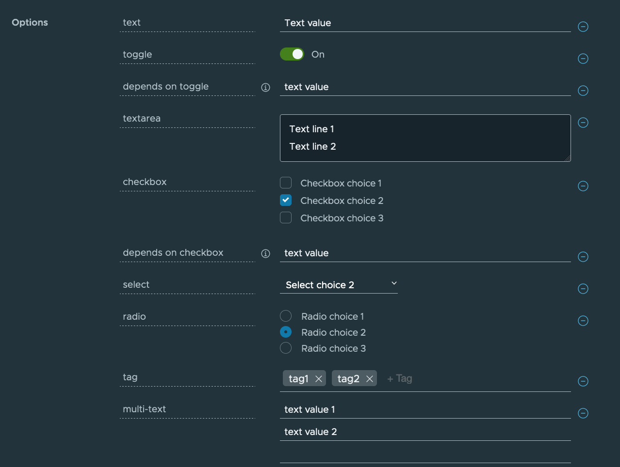
accelerator:
  displayName: Demo Input Types
  description: "Accelerator with options for each inputType"
  iconUrl: https://raw.githubusercontent.com/vmware-tanzu/application-accelerator-samples/main/icons/icon-cloud.png
  tags: ["demo", "options"]

  options:

  - name: text
    display: true
    defaultValue: Text value

  - name: toggle
    display: true
    dataType: boolean
    defaultValue: true

  - name: dependsOnToggle
    label: 'depends on toggle'
    description: Visibility depends on the value of the toggle option being true.
    dependsOn:
      name: toggle
    defaultValue: text value

  - name: textarea
    inputType: textarea
    display: true
    defaultValue: |
      Text line 1
      Text line 2

  - name: checkbox
    inputType: checkbox
    display: true
    dataType: [string]
    defaultValue:
      - value-2
    choices:
      - text: Checkbox choice 1
        value: value-1
      - text: Checkbox choice 2
        value: value-2
      - text: Checkbox choice 3
        value: value-3

  - name: dependsOnCheckbox
    label: 'depends on checkbox'
    description: Visibility depends on the checkbox option containing exactly value value-2.
    dependsOn:
      name: checkbox
      value: [value-2]
    defaultValue: text value

  - name: select
    inputType: select
    display: true
    defaultValue: value-2
    choices:
      - text: Select choice 1
        value: value-1
      - text: Select choice 2
        value: value-2
      - text: Select choice 3
        value: value-3

  - name: radio
    inputType: radio
    display: true
    defaultValue: value-2
    choices:
      - text: Radio choice 1
        value: value-1
      - text: Radio choice 2
        value: value-2
      - text: Radio choice 3
        value: value-3

engine:
  type: YTT
accelerator.axl example
The following snippet shows an example accelerator.axl file:
engine {
  let includePoms = "#buildType == 'Maven'",
      includeGradle =  "#buildType == 'Gradle'"  in {
      Include({"**/*.md" , "**/*.xml" , "**/*.gradle" , "**/*.java"})
      Exclude({"**/secret/**"})
      if (includeGradle) {
        Include({"*.gradle"})
      }
      + if (includePoms) {
        Include({"pom.xml"})
      }
      + Include({"**/*.java", "README.md"}).ReplaceText(substitions: {{text: "Hello World!", with: #greeting}})
      UniquePath(Fail)
      RewritePath("(.*)simpleboot(.*)", #g1 + #packageName + #g2)
      ReplaceText({{text: "simpleboot", with: #packageName}})
  }

}
acclerator.axl description
This section explains the transforms used in the preceding example:
-
engineis the global transform. It produces the final set of files to be zipped and returned from the accelerator. As input, it receives all the files from the accelerator repository root. The properties in this node dictate how this set of files is transformed into a final set of files zipped as the accelerator result. -
Includefilters the set of files, retaining only those matching a list of path patterns. This ensures that the accelerator only detects files in the repository that match the list of patterns. -
Excludefurther restricts which files are detected. The example ensures files in any directory calledsecretare never detected. -
letdefines additional variables and assigns them values. These derived symbols function like options, but instead of being supplied from a UI widget, they are computed by the accelerator itself. -
+executes each of its children in parallel. Each child receives a copy of the current set of input files. These are the files that remain after applying theincludeandexcludefilters. Therefore, each of the children produces a set of files. All the files from all the children are then combined, as if overlaid on top of each other in the same directory. If more than one child produces a file with the same path, the transform resolves the conflict by dropping the file contents from the earlier child and keeping the contents from the later child. -
UniquePathspecifies how conflict is handled when an operation, such as merging, produces multiple files at the same path:Failraises an error when there is a conflict.UseFirstkeeps the contents of the first file.UseLastkeeps the contents of the last file.Appendkeeps both by usingcat FIRST-FILE SECOND-FILE.
Advanced accelerator use
There are advanced features that you can use when writing an accelerator.yaml. For more information see, Creating dynamic parameters using custom types.
