


The Rolling View Chart widget cycles through selected metrics at an interval that you define and shows one metric graph at a time. Miniature graphs, which you can expand, appear for all selected metrics at the bottom of the widget.
How the Rolling View Chart Widget and Configuration Options Work
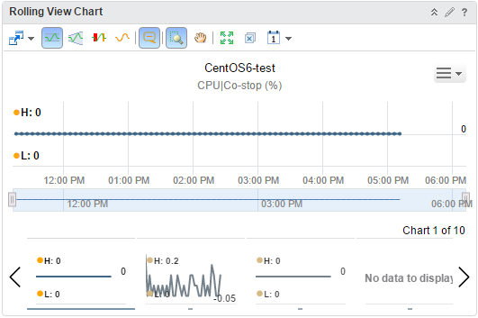
The Rolling View Chart widget shows a full chart for one selected metric at a time. Miniature graphs for the other selected metrics appear at the bottom of the widget. You can click a miniature graph to see the full graph for that metric, or set the widget to rotate through all selected metrics at an interval that you define. The key in the graph indicates the maximum and minimum points on the line chart.
You edit a Rolling View Chart widget after you add it to a dashboard. The changes you make to the options create a custom chart to meet the needs of the dashboard users.
Where You Find the Rolling View Chart Widget
The widget might be included on any of your custom dashboards. From the left menu, click to see your configured dashboards.
To customize the data that appears in the dashboard widget, from the left menu, click . To create your dashboard, from the left menu, click . From the Dashboards panel, click Create. To edit your dashboard, from the left menu, click . From the Dashboards panel, select the dashboard you want to edit and select . Toggle between the Views and Widgets option to view and add a widget or view to the dashboard. The widgets list panel displays a list of all the predefined widgets. Drag a widget to the dashboard workspace in the upper panel.
Rolling View Chart Widget Toolbar Options
On the title bar of the widget, click the Show Toolbar icon to access the toolbar options.
The toolbar contains icons that you can use to change the view of the graphs.
| Option | Description |
|---|---|
| Trend Line | Shows or hides the line and data points that represents the metric trend. The trend line filters out metric noise along the timeline by plotting each data point relative to the average of its adjoining data points. |
| Dynamic Thresholds | Shows or hides the calculated dynamic threshold values for a 24-hour period. |
| Show Entire Period Dynamic Thresholds | Shows or hides dynamic thresholds for the entire time period of the graph. |
| Anomalies | Shows or hides anomalies. Time periods when the metric violates a threshold are shaded. Anomalies are generated when a metric crosses a dynamic or static threshold, either above or below. |
| Zoom to Fit | Changes all graphs to show the entire time period and value range. |
| Zoom the view | Click this icon and drag to outline a part of the hierarchy. The display zooms to show only the outlined section. |
| Pan | Click this icon and click and drag the hierarchy to show different parts of the hierarchy. |
| Show Data Values | After you click the Show data point tips icon to retrieve the data, click this icon and point to a graphed data point to show its time and exact value. In non-split mode, you can hover over a metric in the legend to show the full metric name, the names of the adapter instances (if any) that provide data for the resource to which the metric belongs, the current value, and the normal range. If the metric is currently alarming, the text color in the legend changes to yellow or red, depending on your color scheme. Click a metric in the legend to highlight the metric in the display. Clicking the metric again toggles its highlighted state. |
| Date Controls | Use the date selector to limit the data that appears in each chart to the time period you are examining. Select Dashboard Time to activate the dashboard time panel. The option chosen in the dashboard time panel is effective. The default time is 6 hours. Dashboard Time is the default option. |
Rolling View Chart Widget Configuration Options
On the title bar of the widget, click the Edit Widget icon to configure the widget.
The configuration options are grouped into one or more sections. You can select the objects on which you want to base the widget data and refine the objects in the following sections. Each section filters the objects further and pushes the filtered objects to the next section. The widget data is based on the objects that are the output of the last section.
The Configuration section provides general configuration options for the widget.
The Input Data section provides options to specify input for the widget. This section appears when the widget is in self provider mode.
The Input Transformation section provides options to transform the input for the widget.
The Output Data section provides options to select object types on which you are basing the widget data.
The Output Filter section provides options to restrict the widget data based on the selected filter criteria.
| Option | Description |
|---|---|
| Title | Enter a custom title that identifies this widget from other instances that are based on the same widget template. |
| Configuration | |
| Refresh Content | Activate or deactivate the automatic refreshing of the data in this widget. If not activated, the widget is updated only when the dashboard is opened or when you click the Refresh button on the widget in the dashboard. |
| Refresh Interval | If you activate the Refresh Content option, specify how often to refresh the data in this widget. |
| Self Provider |
Indicates whether the objects for which data appears in the widget are defined in the widget or provided by another widget.
|
| Auto Transition Interval | Time interval for a switch between charts in the widget. |
| Input Data | |
| Metrics |
Select metrics on which you want to base the widget data. You can select an object and pick its metrics.
You can define measurement units for the metrics in the list. Double-click a metric box in the list, select a measurement unit in the Unit drop-down menu, and click Update. |
| Objects |
Select objects on which you want to base the widget data.
|
| All | If you select this option, the widget data is based on all the objects in your environment. The following sections provide options to refine the objects for the widget data. |
| Input Transformation | |
| Relationship | Transform the input for the widget based on the relationship of the objects. For example, if you select the Children check box and a Depth of 1, the child objects are the transformed inputs for the widget. |
| Output Data | |
| Empty drop-down menu | Specifies a list with attributes to display. |
| Add metrics based on object types. The objects corresponding to the selected metrics are the basis for the widget data.
|
|
| Output Filter | |
| Refine the widget data further based on the filter criteria for object types. The widget data is based on the objects for the filtered object types. If the objects have a tag filter applied in the Basic subsection, you define filter criteria for the object types of the objects with tag filter applied. If the objects with tag filter applied do not belong to any of the object types in this filter criteria, the widget skips this filter and includes all the objects with tag filter applied. If the objects have an input transformation applied, you define filter criteria for the object types of the transformed objects.
|
|
