


The Scoreboard Health widget displays color-coded health, risk, efficiency, and custom metrics scores for objects that you select.
How the Scoreboard Health Widget and Configuration Options Work
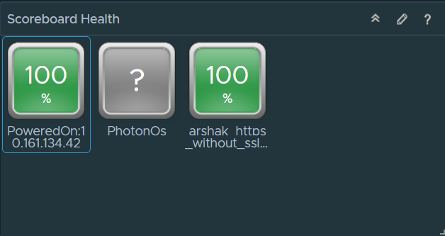
The icons for each object are color coded to give a quick indication of the state of the object. You can configure the widget to display the scores of common or specific metrics of the object. You can use the symptom state color code or you can define your criteria to color the images. If you configure the widget to show the metric for objects that do not have this metric, those objects have blue icons.
You can double-click an object icon to show the Object Detail page for the object. When you point to the icon, a tool tip shows the name of the object and the name of the metric.
You edit a Scoreboard Health widget after you add it to a dashboard. To configure the widget, click the pencil at the upper-right corner of the widget window. The widget can display metrics of the objects that you select when you edit the widget, or that you select on another widget. For example, you can configure the widget to show the CPU workload of an object that you select on the Topology Graph widget. To set a source widget that is on the same dashboard, you must use the Widget Interactions menu when you edit a dashboard. To set a source widget that is on another dashboard, you must use the Dashboard Navigation menu when you edit the source dashboard.
Where You Find the Scoreboard Health Widget
The widget might be included on any of your custom dashboards. From the left menu, click to see your configured dashboards.
To customize the data that appears in the dashboard widget, from the left menu, click . To create your dashboard, from the left menu, click . From the Dashboards panel, click Create. To edit your dashboard, from the left menu, click . From the Dashboards panel, select the dashboard you want to edit and select . Toggle between the Views and Widgets option to view and add a widget or view to the dashboard. The widgets list panel displays a list of all the predefined widgets. Drag a widget to the dashboard workspace in the upper panel.
Scoreboard Health Widget Configuration Options
On the title bar of the widget, click the Edit Widget icon to configure the widget.
The Configuration section provides general configuration options for the widget.
The configuration options are grouped into one or more sections. You can select the objects on which you want to base the widget data and refine the objects in the following sections. Each section filters the objects further and pushes the filtered objects to the next section. The widget data is based on the objects that are the output of the last section.
The Input Data section provides options to specify input for the widget. This section appears when the widget is in self provider mode.
| Option | Description |
|---|---|
| Title | Enter a custom title that identifies this widget from other instances that are based on the same widget template. |
| Configuration | |
| Refresh Content | Activate or deactivate the automatic refreshing of the data in this widget. If not activated, the widget is updated only when the dashboard is opened or when you click the Refresh button on the widget in the dashboard. |
| Refresh Interval | If you activate the Refresh Content option, specify how often to refresh the data in this widget. |
| Self Provider |
Indicates whether the objects for which data appears in the widget are defined in the widget or provided by another widget.
|
| Image Type | Select an image type for the metrics. |
| Metric | Select the default or custom metric. |
| Pick Metric | Active only when you select Custom from the Metric menu. Use to select a custom metric for the objects that the widget displays. Click Pick Metric and select an object type from the Object Type pane. Use the Metric Picker pane to select a metric from the metric tree and click Select Object to check the objects from the type that you select on the Object Types pane. |
| Use Symptom state to color chart | Select to use the default criteria to color the image. |
| Custom ranges | Use to define custom criteria to color the image. You can define a range for each color. |
| Input Data | |
|
Select objects on which you want to base the widget data.
|
|
