


The requirements of the CIO, Head of Global Infrastructure, and IT Senior Management vary from the requirements of the technical teams. The Executive Summary dashboards provide an overall information on capacity and inventory in business terms.
These dashboards allow you to display problems related to budget and resource, and provide visibility to the senior management into the live environment. By doing this, you can prove the need for additional hardware. If there is wastage that has to be reclaimed, you can display where and how large the wastage is using these dashboards.
vRealize Operations provides two example dashboards to get you started. As each executive might have a unique requirement or preference, the dashboards can be customized accordingly. The five principles displayed in the following figure are used to design the
Executive Summary dashboards.
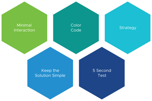
- Keeping the interaction, such as clicking, zooming, and sorting to a minimal.
- Use of color codes to have a user interface that is easy to understand.
- Each dashboard answers a specific question and the information is presented in business terms.
- Keep the solution simple and have a portal that is easy to access.
- Ensure that the dashboards are understood within five seconds.
