


A dashboard projected on the large screen serves a different business purpose than a dashboard on your laptop or desktop. It is placed strategically because it displays a time sensitive information. Dashboards complement alerts and cannot replace it. The five principles displayed in the following figure are used to design the predefined Network Operation Center dashboards.
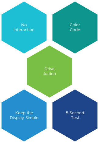
- Keeping the interaction, such as clicking, zooming, and sorting to a minimal. Avoid having buttons, use of mouse or keyboard to view data.
- Use of color codes to have a user interface that is easy to understand.
- Displaying content that drives action. Display of live information as the focus is on immediate remediation. Problems that need immediate actions are displayed, for example, stop provisioning of new VM or take action on VMs that abuse the shared infrastructure.
- Display of problems that do not require immediate attention are avoided, for example, increase supply of infrastructure, such as adding hardware.
- Keep the display simple and have a portal that is easy to access.
- Dashboards are designed to display minimal and critical information only.
- Displays of numbers in percentage, with 0% being poor and 100% being perfect. To display utilisation, you can use the following markers:
- 50% indicates good and balanced utilization. However, the ideal value is 75%
- 0% indicates wastage
- 100% indicates high utilization
- Ensure that the dashboards are understood within five seconds.
