The Cluster Contention dashboard is the primary dashboard for vSphere cluster performance. It is designed for VMware administrators or architects. It can be used for both, monitoring and troubleshooting. Once you determine that there is a performance issue, use the Cluster Utilization dashboard to see if the contention is caused by high utilization.
Design Considerations
This dashboard is used as part of your Standard Operating Procedure (SOP). It is designed for daily use, hence the views are set to show data for the last 24 hours. The dashboard provides performance metrics for virtual machines in the selected data center.
Utilization of the cluster is not shown in the Cluster Contention dashboard. You must separate the two concepts: utilization and contention. Performance and capacity are different concepts managed by two separate teams. Both CPU and memory are also shown separately. You can have a problem with one, without any issue in the other. CPU is more common as memory tends to have a lower overcommit ratio.
To view the common design considerations among all performance management dashboards, see the Performance Dashboards.
How to Use the Dashboard
- Average Cluster Performance (%).
- This is the primary KPI for your entire IaaS. It plots how your IaaS is performing every 5 minutes, giving you the trend view of the overall performance.
- The metric itself is simply the average of the Cluster KPI / Performance (%) metric. This performance metric in turn averages the VM Performance / Number of KPIs Breached metric from all the running VMs in the cluster. Hence a value of 100% indicates that every running VM in the cluster is served well.
- As this KPI takes into account every running VM in your environment, the number should be steady. The analogy in real life is the stock market index. While individual stocks can be volatile, overall the index should be relatively steady on a 5 minutes by 5 minutes basis.
- The relative movement of the metric is as important as the absolute value of the metric. Your absolute number might not be as high you want it to be, but if there are no complaints for a long time, then there is no urgent business justification to improve it.
- Clusters Performance.
- It lists all the clusters, sorted by the least performing cluster in the last one week. You can change this time period.
- The worst performance shows the lowest number in the time period. As vRealize Operations collects data every 5 minutes, there are 12 x 24 x 7 = 2016 data points in a week. This column shows the worst point among these 2016 datapoints.
- A single number among 2016 datapoints can be an outlier that needs to be complemented with another number sometimes. A logical choice is the average of these numbers. For the average performance to be low, a lot of criterias have to be low. Waiting for the average causes a delay in your operations, and rise in complaints. For performance monitoring, the 95th percentile is a better summary than the average.
- Your cluster should function at a 100% and perform its fuctions as planned.
- Select a cluster from the table.
- All the health charts show the KPI of the selected cluster.
- For performance, it is important to show both the depth and breadth of the performance problems. A problem that impacts one or two VMs requires a different troubleshooting than a problem that impacts all the VMs in the cluster.
- The depth is shown by reporting the worst among any VM counter. So the highest value of VM CPU Ready, VM Memory contention, and VM Disk Latency among all the running VMs are shown. If the worst number is good, then you do not need to look at the rest of the VMs.
- A large cluster with thousands of VMs can have a single VM experiencing poor performance while 99.9% of the VM population is fine. The depth counter might not report that most VMs are fine. It only reports the worst. This is where the breadth counters come in.
- The breadth counters report the percentage of the VM population that is experiencing performance problem. The threshold is set to be stringent, as the goal is to provide early warning and enable proactive operations.
Points to Note
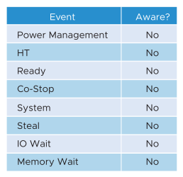
It is possible for VMs in the cluster to suffer from poor performance, while the cluster utilization is low. One main reason is cluster utilization looks at the provider layer (ESXi), while performance looks at individual consumer (VM). The following table shows various possible reasons.
From the performance management point of view, the vSphere cluster is the smallest logical building block of the resources. While the resource pool and VM Host affinity can provide a smaller slice, they are operationally complex, and they cannot deliver the promised quality of IaaS service. Resource pool cannot provide a differentiated class of service. For example, your SLA states that gold is two times faster than silver because it is charged at 200% more. The resource pool can give gold two times more shares. Whether those extra shares translate into half the CPU readiness cannot be determined up front.
Certain settings such as DRS automation level and the presence of many resource pools can impact performance. Consider adding a property widget to show the relevant property of a selected cluster, and a relationship widget to show resource pools.
For a large environment with many clusters, add a grouping to make the list more manageable. Group it by class of service, so you can focus more on the critical clusters.