


The Sparkline Chart widget displays graphs that contain metrics for an object in vRealize Operations. You can use vRealize Operations to create one or more graphs that contain metrics for objects that you add to your custom dashboards.
How the Sparkline Chart Widget and Configurations Options Work
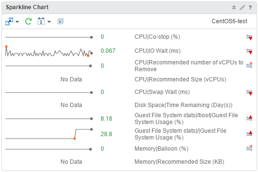
If the metrics in the Sparkline Chart are for an object that another widget provides, the object name appears at the top right of the widget. If you select a metric when you edit the widget configuration, the widget uses the metric and its corresponding object as the source for dashboard interactions. The line in the graphs represents the average value of the selected metric for the specified time period. The boxed area in the graph represents the dynamic threshold of the metric.
Point to a graph in the Sparkline Chart widget to view the value of a metric in the form of a tool tip. You can also view the maximum and minimum values on a graph. The values are displayed as orange dots.
You can add the Sparkline Chart widget to one or more custom dashboards and configure it to display data that is important to different dashboard users. The data that appears in the widget is based on the configured options for each widget instance.
The metrics shown in sparkline widget is the current value, to view the average value you can use transformations in list views or distribution charts to calculate an average. Another way to get to an average value is to double click on the sparkline to open the metric chart, click and drag to select a range, keep the mouse button depressed and hover for a few seconds, you should see a popup that has average value.
Where You Find the Sparkline Chart Widget
The widget might be included on any of your custom dashboards. On the menu, click Dashboards to display a list of dashboards in the left pane.
Sparkline Chart Widget Toolbar Options
On the title bar of the widget, click the Show Toolbar icon to access the toolbar options.
The toolbar contains icons that you can use to change the view of the graphs.
| Option | Description |
|---|---|
| Dashboard Navigation | You can navigate to another dashboard when the object you select is also available in the dashboard to which you want to navigate. |
| Refresh | Refreshes the widget data. |
| Time Range | Select the range for the time period to show on the graphs. You can select a period from the default time range list or select start and end dates and times. Select Dashboard Time to enable the dashboard time panel. The option chosen in the dashboard time panel is effective. The default time is 6 hours. Dashboard Time is the default option. |
| Remove All | Removes all graphs. |
Sparkline Chart Widget Configuration Options
On the title bar of the widget, click the Edit Widget icon to configure the widget.
The configuration options are grouped into one or more sections. You can select the objects on which you want to base the widget data and refine the objects in the following sections. Each section filters the objects further and pushes the filtered objects to the next section. The widget data is based on the objects that are the output of the last section.
The Configuration section provides general configuration options for the widget.
The Input Data section provides options to specify input for the widget. This section appears when the widget is in self provider mode.
The Input Transformation section provides options to transform the input for the widget.
The Output Data section provides options to select object types on which you are basing the widget data.
The Output Filter section provides options to restrict the widget data based on the selected filter criteria.
| Option | Description |
|---|---|
| Title | Enter a custom title that identifies this widget from other instances that are based on the same widget template. |
| Configuration | |
| Refresh Content | Enable or disable the automatic refreshing of the data in this widget. If not enabled, the widget is updated only when the dashboard is opened or when you click the Refresh button on the widget in the dashboard. |
| Refresh Interval | If you enable the Refresh Content option, specify how often to refresh the data in this widget. |
| Self Provider |
Indicates whether the objects for which data appears in the widget are defined in the widget or provided by another widget.
|
| Show Object Name | You can view the name of the object before the metric name in the Sparkline Chart widget.
|
| Column Sequence |
Select the order in which to display the information.
|
| Show DT | Select an option to show or hide the dynamic threshold for the sparkline chart. |
| Input Data | |
| Metrics |
Select metrics on which you want to base the widget data. You can select an object and pick its metrics.
Optionally, you can customize a metric and apply the customization to other metrics in the list.
|
| Objects |
Select objects on which you want to base the widget data.
|
| All | If you select this option, the widget data is based on all the objects in your environment. The following sections provide options to refine the objects for the widget data. |
| Input Transformation | |
| Relationship | Transform the input for the widget based on the relationship of the objects. For example, if you select the Children check box and a Depth of 1, the child objects are the transformed inputs for the widget. |
| Output Data | |
| Empty drop-down menu | Specifies a list with attributes to display. |
| Add metrics based on object types. The objects corresponding to the selected metrics are the basis for the widget data. Click the Add New Metrics icon to add metrics for the widget data. Select an object to view its metric tree and pick metrics for the object. The picked metrics appear in a list in this section. The metric tree shows common metrics for several objects when you click the Show common metrics icon. While selecting objects for which you want to pick metrics, you can use the Filter text box to search for objects. You can also expand the Tag Filter pane on the left hand side to select one or more object tag values. A list of objects with the selected tag values appears. If you select more than one value for the same tag, you can choose objects that have any of the tags applied. If you select more than one value for different tags, you can choose only the objects that have all the tags applied. Optionally, you can customize a metric and apply the customization to other metrics in the list.
|
|
| Output Filter | |
| Refine the widget data further based on the filter criteria for object types. The widget data is based on the objects for the filtered object types. If the objects have an input transformation applied, you define filter criteria for the object types of the transformed objects.
|
|
