


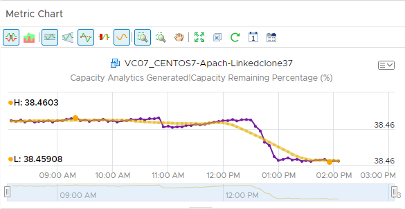
You can use the Metric Chart widget to monitor the workload of your objects over time. The widget displays data based on the metrics that you select.
How the Metric Chart Widget and Configuration Options Work
You can add the Metric Chart widget to one or more custom dashboards and configure it to display the workload for your objects. The data that appears in the widget is based on the configured menu items for each widget instance.
You edit the Metric Chart widget after you add it to a dashboard. The changes you make to the menu items create a custom widget with the selected metrics that display the workload on your objects.
To select metrics, you can select an object from the object list, then select the metrics. Or, you can select a tag from the object tag list to limit the object list, then select an object. You can configure multiple charts for the same object or multiple charts for different objects.
To use the metric configuration, which displays a set of metrics that you defined in an XML file, the dashboard and widget configuration must meet the following criteria:
- The dashboard Widget Interaction menu items are configured so that another widget provides objects to the target widget. For example, an Object List widget provides the object interaction to a chart widget.
- The widget Self Provider options are set to Off.
- The custom XML file in the Metric Configuration drop-down menu is in the /usr/lib/vmware-vcops/tools/opscli directory and has been imported into the global storage using the import command.
Where You Find the Metric Chart Widget
The widget might be included on any of your custom dashboards. From the left menu, click to see your configured dashboards.
To customize the data that appears in the dashboard widget, from the left menu, click . To create your dashboard, from the left menu, click . From the Dashboards panel, click Create. To edit your dashboard, from the left menu, click . From the Dashboards panel, select the dashboard you want to edit and select . Toggle between the Views and Widgets option to view and add a widget or view to the dashboard. The widgets list panel displays a list of all the predefined widgets. Drag a widget to the dashboard workspace in the upper panel.
Metric Chart Widget Toolbar Options
On the title bar of the widget, click the Show Toolbar icon to access the toolbar options.
The toolbar contains icons that you can use to change the view of the graphs.
| Option | Description |
|---|---|
| Split Charts | Displays each metric in a separate chart. |
| Stacked Chart | Consolidates all charts into one chart. This chart is useful for seeing how the total or sum of the metric values vary over time. To view the stacked chart, ensure that the split chart option is turned off. |
| Dynamic Thresholds | Shows or hides the calculated dynamic threshold values for a 24-hour period. |
| Show Entire Period Dynamic Thresholds | Shows or hides dynamic thresholds for the entire time period of the graph. |
| Static Thresholds | Shows or hides the threshold values that have been set for a single metric. |
| Anomalies | Shows or hides anomalies. Time periods when the metric violates a threshold are shaded. Anomalies are generated when a metric crosses a dynamic or static threshold, either above or below. |
| Trend Line | Shows or hides the line and data points that represents the metric trend. The trend line filters out metric noise along the timeline by plotting each data point relative to the average of its adjoining data points. |
| Show Data Values | Enables the data point tooltips if you switched to a zoom or pan option. Show Data Point Tips must be enabled. |
| Zoom All Charts | Resizes all the charts that are open in the chart pane based on the area captured when you use the range selector. You can switch between this option and Zoom the View. |
| Zoom the View | Resizes the current chart when you use the range selector. |
| Pan | When you are in zoom mode, allows you to drag the enlarged section of the chart so that you can view higher or lower, earlier or later values for the metric. |
| Zoom to Fit | Resets the chart to fit in the available space. |
| Remove All | Removes all the charts from the chart pane, allowing to you begin constructing a new set of charts. |
| Refresh Charts | Reloads the charts with current data. |
| Date Controls | Opens the date selector. Use the date selector to limit the data that appears in each chart to the time period you are examining. Select Dashboard Time to enable the dashboard time panel. The option chosen in the dashboard time panel is effective. The default time is 6 hours. Dashboard Time is the default option. |
| Generate Dashboard | Saves the current charts as a dashboard. |
| Save as PDF | Saves the current metric chart as a PDF file. If you have added many metrics for different objects to a metric chart, you can quickly download and share the PDF file with another user or VM owner. You can create ad-hoc reports when analyzing metrics. You can also add notes to the metrics to provide context to the user. |
Metric Chart Widget Graph Selector Options
The graph selector options determine how individual data appears in the graph.
| Option | Description |
|---|---|
| Close | Deletes the chart. |
| Save a snapshot | Creates a PNG file of the current chart. The image is the size that appears on your screen. You can retrieve the file in your browser's download folder. |
| Download comma-separated data | Creates a CSV file that includes the data in the current chart. You can retrieve the file in your browser's download folder. |
| Save a full screen snapshot | Downloads the current graph image as a full-page PNG file, which you can display or save. You can retrieve the file in your browser's download folder. |
| Units | You can display the data with dots or as a percentage. |
| Thresholds | You can choose to show/hide Critical, Immediate, and Warning thresholds in the current chart. |
| Scales | You can choose a scale for a stacked chart.
|
| Move Down | Moves the chart down one position. |
| Move Up | Moves the chart up one position. |
You can take the following actions on the Metric Chart graph.
| Option | Description |
|---|---|
| Y Axis | Shows or hides the Y-axis scale. |
| Chart | Shows or hides the line that connects the data points on the chart. |
| Data Point Tips | Shows or hides the data point tooltips when you hover the mouse over a data point in the chart. |
| Zoom by X | Enlarges the selected area on the X axis when you use the range selector in the chart to select a subset of the chart. You can use Zoom by X and Zoom by Y simultaneously. |
| Zoom by Y | Enlarges the selected area on the Y axis when you use the range selector in the chart to select a subset of the chart. You can use Zoom by X and Zoom by Y simultaneously. |
| Zoom by Dynamic Thresholds | Resizes the Y axis of the chart so that the highest and the lowest values on the axis are the highest and the lowest values of the dynamic threshold calculated for this metric. |
| Vertical resize | Resizes the height of a graph in the chart. |
| Remove icon next to each metric name in a stacked chart | Removes the graph for the metric from the chart. |
Metric Chart Configuration Options
On the title bar of the widget, click the Edit Widget icon to configure the widget.
The configuration options are grouped into one or more sections. You can select the objects on which you want to base the widget data and refine the objects in the following sections. Each section filters the objects further and pushes the filtered objects to the next section. The widget data is based on the objects that are the output of the last section.
The Configuration section provides general configuration options for the widget.
The Input Data section provides options to specify input for the widget. This section appears when the widget is in self provider mode.
The Input Transformation section provides options to transform the input for the widget.
The Output Data section provides options to select object types on which you are basing the widget data.
The Output Filter section provides options to restrict the widget data based on the selected filter criteria.
| Option | Description |
|---|---|
| Title | Enter a custom title that identifies this widget from other instances that are based on the same widget template. |
| Configuration | |
| Refresh Content | Enable or disable the automatic refreshing of the data in this widget. If not enabled, the widget is updated only when the dashboard is opened or when you click the Refresh button on the widget in the dashboard. |
| Refresh Interval | If you enable the Refresh Content option, specify how often to refresh the data in this widget. |
| Self Provider |
Indicates whether the objects for which data appears in the widget are defined in the widget or provided by another widget.
|
| Input Data | |
| Metrics |
Select metrics on which you want to base the widget data. You can select an object and pick its metrics.
Optionally, you can customize a metric and apply the customization to other metrics in the list.
|
| Objects |
Select objects on which you want to base the widget data.
|
| All | If you select this option, the widget data is based on all the objects in your environment. The following sections provide options to refine the objects for the widget data. |
| Input Transformation | |
| Relationship | Transform the input for the widget based on the relationship of the objects. For example, if you select the Children check box and a Depth of 1, the child objects are the transformed inputs for the widget. |
| Output Data | |
| Empty drop-down menu | Specifies a list with attributes to display. |
|
Select metrics on which you want to base the widget data. You can select an object and pick its metrics.
Optionally, you can customize a metric and apply the customization to other metrics in the list.
|
|
| Output Filter | |
| Refine the widget data further based on the filter criteria for object types. The widget data is based on the objects for the filtered object types. If the objects have an input transformation applied, you define filter criteria for the object types of the transformed objects.
|
|
