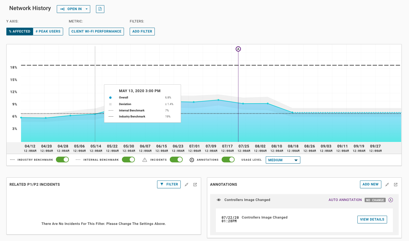
The network history page allows you to view performance metrics over a period of up to 2 years. This page is commonly used to view changes in performance over time and correlate changes in your environment to performance degradation or improvements. Using this page, you can quickly see when problem arise. Additionally, VMware Edge Network Intelligence also tracks changes to your WLAN config and can use that to create automatic annotations for version and config changes.
The network history page defaults to the Wi-Fi performance metric, which looks at overall Wi-Fi performance for your network. The graph shows the percent affected for the metric shown, or the percentage of clients who were negatively affected by poor performance. Lower numbers indicate better performance.
These metrics can be scoped by site or shown for the overall enterprise.

There are many options on this page, the following table describes the options and their affect
| Option |
Description |
|---|---|
| % Affected |
The default view for network history values. The number is the percent of the total users in the scope negatively impacted by the shown metric (i.e., Poor Wi-Fi performance) |
| # Peak users |
The number of users using the service the metric is based on. |
| Metric |
The metric selected for the graph - see the metric table for more info |
| Add Filter |
Click to add filters to the graph. Each metric has a set of filters that can be applied. For example, Wi-Fi performance can be filtered on a specific building or floor. You can add up to 5 of the same type of filter to create a layered line graph |
| Industry Benchmark |
This is the average benchmark for the industry you are in (higher education, Healthcare, Manufacturing, retail etc.) it also takes into consideration size, AP vendor, location etc. |
| Internal Benchmark |
This is the internal average for your organization - this is useful when looking at a site and comparing it to the overall average |
| Incidents |
This turns on or off indicators that show when ENI created an incident for the metric |
| Annotations |
This turns on and off the annotation indicators in the timeline |
| Usage Level |
Networks perform differently depending on the usage level. When a network is under high usage you may experience more congestion or poorer performance. Using this selector, you can toggle between High Medium and Low usage. If your graph shows --- lines it is because for the usage shown there is no baseline calculated for that usage level |
| Add New Annotation |
This allows you to add a new manual annotation to the network history. If you are scoped to a site, it will only be visible for that site. You can also scope it to a custom groups or building. These are useful for noting when you have added or moved AP's or made changes to your infrastructure like adding additional bandwidth |