Performance is about ensuring workloads get the necessary resources and Performance Management is largely an exercise in elimination. The methodology slices each layer and determines if that layer is causing any performance problems. It is imperative to have a single metric to indicate if a particular layer is performing or not. This primary metric is aptly named Key Performance Indicator (KPI).
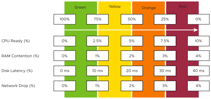
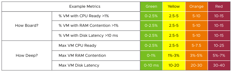
Each metric, such as disk latency, has four ranges: Green, Yellow, Orange, and Red.
For ease of monitoring, the range is mapped to 0–100% . Green maps to 75–100%, and Red maps to 0 -25%. Dividing 100% into four equal ranges enables each range to have a decent size band.
The technique above enables metrics with different units to be combined. Each of them is mapped to the same band, which is a percentage.
The logic to properly map a metric to four ranges needs five metrics and not four. For example, in Disk Latency:
-
If it is 41 ms, then it is 0% (That is Red), because the upper limit of Red is 40 ms.
-
If it is 35 ms, then it is 12.5%, because it is in the middle of 30 ms and 40 ms and is Red.
-
If it is 30 ms, then it is 25%, as it is in the border of Red and Orange.
Once each metric is converted into a 0–100% range, the average is taken, not the peak, to derive the KPI metric. Average is used to avoid any metric from dominating the KPI value. If any metric is critical to your operations, you can use alerts for that. Using an average reflects the reality, as each metric is accounted for equally.
These dashboards use KPIs to display the performance of Horizon sessions at the consumer layer and the aggregate performance of workloads at the Horizon infrastructure layer. These dashboards are designed for the Horizon architect or the lead administrator. They give an overall performance of the datacenter portion of Desktop as a Service.
Horizon from Performance Management viewpoint
For performance monitoring and troubleshooting, Horizon is similar to a client/server architecture, where the client is over the WAN network. The network and datacenter components are independent of each other, they use different sets of metrics and have to be monitored as an entity by itself. They have their own set of remediation actions. In a large enterprise, the network is owned by a separate team.
The Management Pack for Horizon monitors then separately, providing KPI.
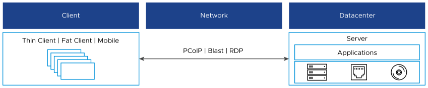
The client component is the last focus of performance monitoring, as it is essentially acts like a television. It displays the pixels transmitted and accept simple input. Also, a problem with a client tends to be isolated. However, network and datacenter outage can impact many users.
The Three Processes of Performance Troubleshooting
The three distinct processes in performance management are:
-
Planning. This is where you set the performance goal. When you architect that vSAN, how many millisecond of disk latency did you have in mind? 10 ms measured at VM level (not vSAN level) is a good start.
-
Monitoring. This is where you compare Plan vs Actual. Does the reality match what your architecture was supposed to deliver? If not, then you must fix it.
-
Troubleshooting. You do this when the reality is worst the than plan, not when there is a complaint. You do not want to take time in troubleshooting, so it is best done proactively.
The Two Metrics of Performance Management
The primary counter for performance is contention. Most customers look at utilization, because they fear something wrong will happen if it is high. That something is contention. Contention manifests in different forms. It can be queue, latency, dropped, aborted, or context switch.
Do not confuse ultra high utilization indicators as performance problem. Just because an ESXi Host is experiencing ballooning, compression, and swapping, it does not mean your VM has memory performance problems. You measure the performance of the host by how well it serves its VMs. While it is related to ESXi utilization, the performance metric is not based on the utilization. It is based on contention metrics.
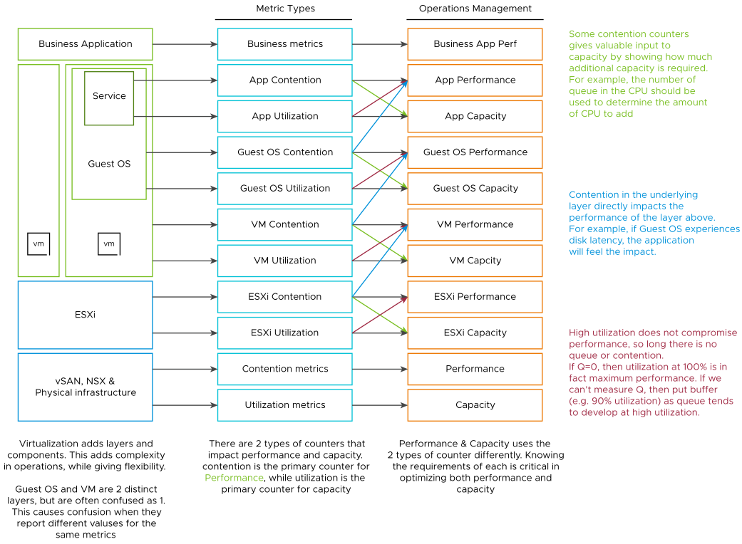
It is possible for VMs in the cluster to suffer from poor performance, while the cluster utilization is low. One main reason being, the cluster utilization looks at the provider layer (ESXi), while the performance looks at an individual consumer (VM).
From the performance management point of view, the vSphere cluster is the smallest logical building block of the resources. While the resource pool and VM Host affinity can provide a smaller slice, they are operationally complex, and they cannot deliver the promised quality of IaaS service. Resource pool cannot provide a differentiated class of service. For example, your SLA states that premium desktop is two times faster than regular desktop because it is charged at 200%. The resource pool can give premium desktop two times more shares. Those extra shares that translate into half the CPU readiness cannot be determined up-front.
Depth and Breadth
Proactive Monitoring requires insights from greater than 1 angle. If there is a problem that a user is hit by a performance problem, your next questions are:
-
How bad is it? You want to gauge the depth of the problem.
-
How many users are affected? You want to gauge the breadth of the problem.
The answer of the second question impacts the course of troubleshooting. Is the incident isolated or widespread? If it is isolated, then you look at the affected object more closely. If it is a widespread problem, then you look at the common areas (Such as clusters, datastores, resource pools, and hosts) that are shared among the affected object.
Notice that you did not ask what is the average performance? as average is too late in this case. By the time the average performance is bad, likely half the population is affected.
Count() works better than Percentage() when the member count is large. For example, in a VDI environment with 100 thousand users, five users affected is 0.005%. It is easier to monitor using count as it translates into real life.
Overall Flows
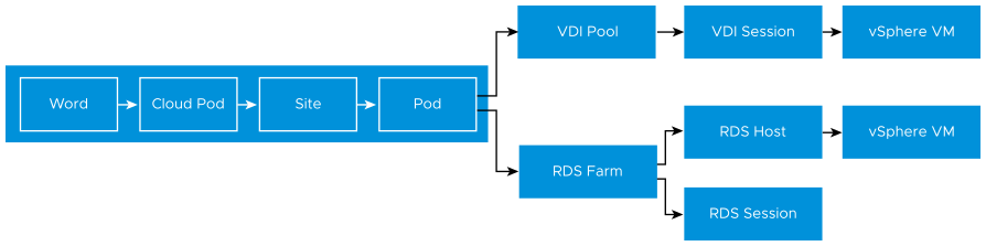
The Management Pack for Horizon dashboards are not designed in isolation. They form a flow, passing context as you drill down. The following example shows how you can drill down from the birds-eye view down to the underlying VM supporting a session. The first dashboard covers all the Pods in the Horizon World. From it, you can drill-down to either RDS Farm or VDI Pool. Within each branch, you can drill down to the individual session.
Design Consideration
All the performance dashboards share the same design principles. They are intentionally designed to be similar, as it is confusing if each dashboard looks different from the other. The dashboards have the same objective.
The dashboard is designed top-down with the Summary and Detail sections.
-
The Summary section is generally placed at the top of the dashboard. It gives the larger picture.
-
The Detail section is placed below the Summary section. It lets you drill down into a specific object. For example, if it is VM performance, you can get the performance details of a specific VM.
This Detail section is also designed with quick context switch, as you can check the performance of multiple objects during performance troubleshooting. For example, RDS Host Performance dashboard gives you all the RDS Host specific information and allows you to see the KPIs without changing screens. You can move from one RDS Host to another and view the details without opening multiple windows.
From the User Interface perspective, the dashboard uses progressive disclosure to minimize information overload and ensure the webpage loads fast. As long as your browser session remains active, it remembers your last selection.
Color as Meaning
The dashboard uses color to convey meaning as different thresholds are used.
| Counter | Threshold Used |
|---|---|
| KPI | Green: 75% - 100% Yellow: 50% - 75% Orange: 25% - 50% Red: 0% - 25% Correspondingly, the threshold sets are 25%, 50%, and 75%. |
| Count of something in the Red. For example, count of VDI Sessions with Red KPI. |
Expect this to be 0 at all times, as there should be no VDI sessions with a KPI value that falls in the Red range. Correspondingly, the threshold sets are 1, 2, and 3. If you want red to appear with count as 1, then you can set it to 0.1, 0.2, or 1. |
Expect the numbers shown to be in the Green zone (75%-100%). The average value may not be 100%, but aim for it to be in the green range.
Table as Insight
A table is simply a list, where each row represents an object, and each column shows a single value. This lists hundreds of rows, with the ability to filter and sort. Each cell value can also be color coded.
Table is good for details. However, as a summary, the main problem is how to give an insight over time as each cell can only hold one value. How to give an insight into what happens in the past? For example, how to see the performance in the last 1 week? There are thousands of datapoints in the last seven days, which one do you pick?
There are a few possible options in VMware Aria Operations 8.2
-
The current number. It is useful to show the present situation. However, this does not show what happened five minutes ago.
-
The average of the period. Average is a lagging indicator. By the time the average is bad, roughly 50% of the number is unlikely to be good.
-
The worst of the period. This can be too extreme, as it only takes one peak. A single number among hundreds of datapoints can be an outlier in some cases. It is great for peak detection but needs to be complemented.
-
The 95th percentile. This is a good midpoint between Average and Worst. For performance monitoring, 95th percentile is a better summary than average.
Use both the Worst and 95th Percentile numbers together, starting with the 95th percentile. If the numbers are far apart, then it indicates that the Worst is likely an outlier.
For greater visibility, consider adding 98th percentile to complement 95th and the worst.
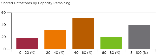
Bar Chart as Insight
Distribution Charts comes in many shapes, with bar chart being one of the most familiar. It can be used to give insights on a large datasets. For example, vSphere shared datastores are shown by their capacity remaining. They are categorized into five buckets, from the lowest capacity remaining to the highest. Each bucket is given a color to convey a meaning. The capacity greater than 80% is given a gray color, as a large amount of unused capacity indicates a waste of resource.